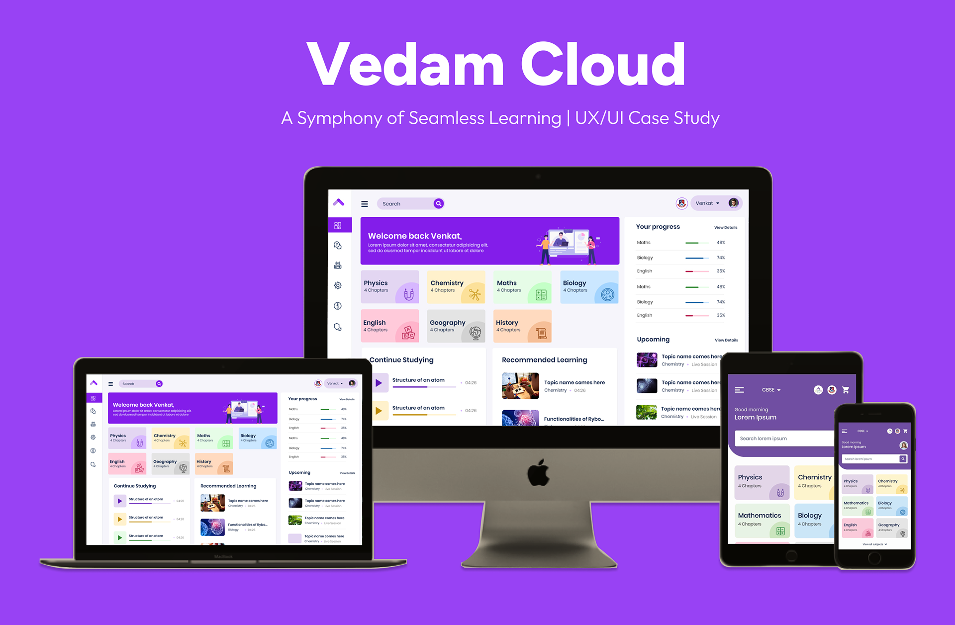
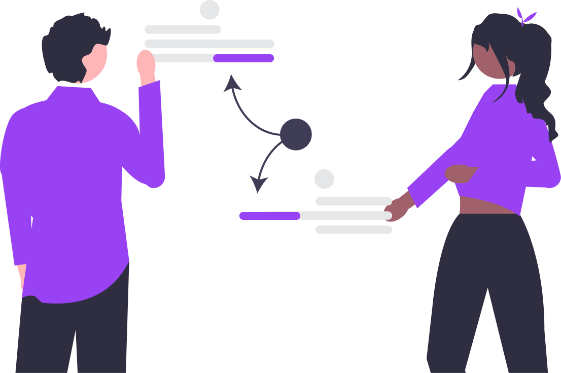
Objective
To design and deliver a comprehensive e-learning platform that simplifies access to education, enhances user engagement through interactive and gamified tools, and ensures accessibility across all devices. The platform aims to address critical challenges in navigation, interactivity, and inclusivity, ultimately creating a seamless and personalized learning experience for students.
My Roles: From Insights to Impact
• User Research & Persona Creation
• Wireframing & Prototyping
• Usability Testing & Accessibility Design
• Visual Designs including design system
• Working with stakeholders and developers
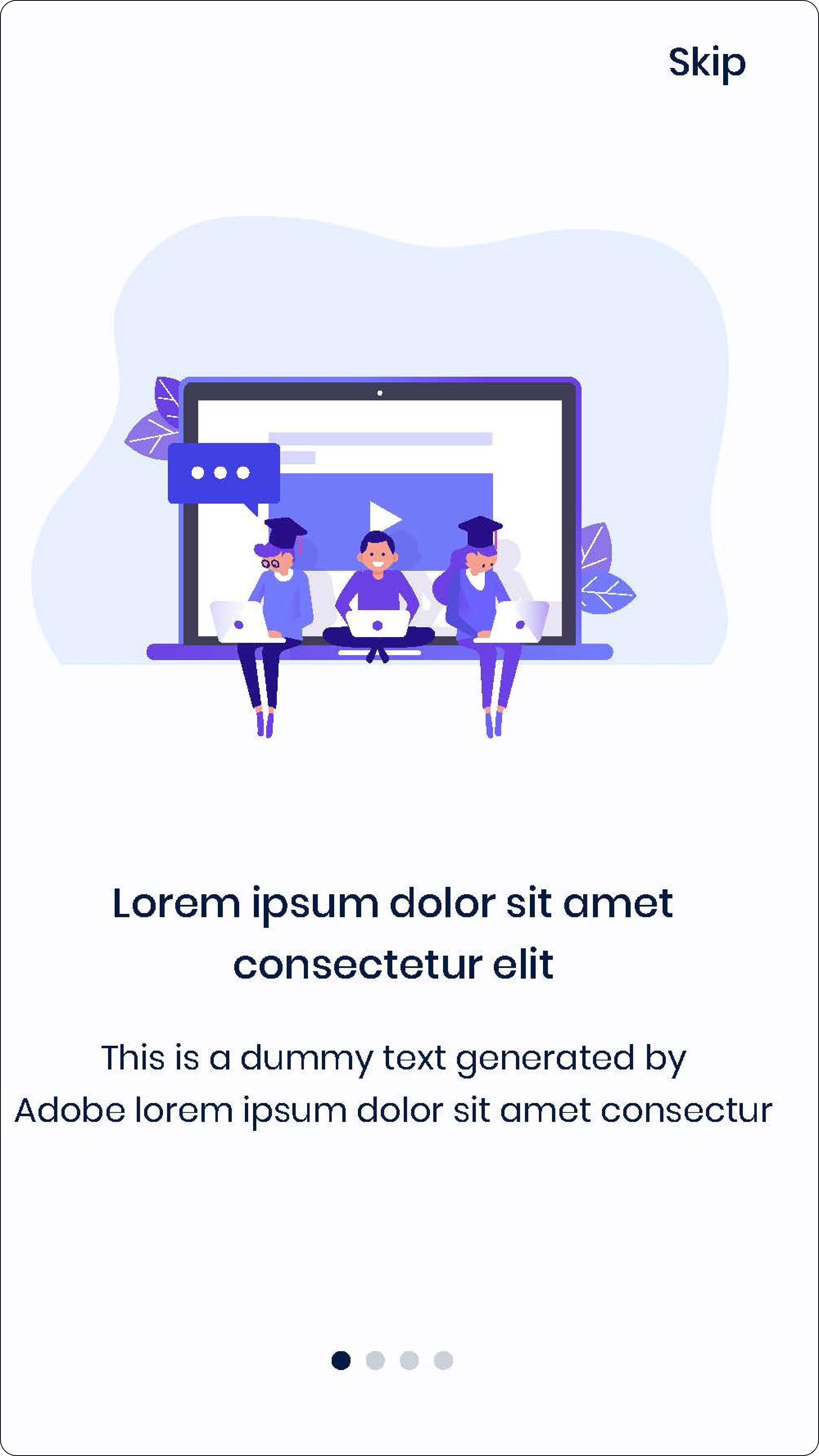
The Challenge: Cracking the Code of Student Engagement
E-learning platforms were plagued with complex navigation, uninspiring interfaces, and poor mobile responsiveness. Our mission was clear to tackle these challenges by introducing:
• Streamlined Navigation: Simplified and intuitive pathways for users to access their courses, materials, and tools.
• Engaging Interfaces: Designed vibrant and interactive elements, such as gamified quizzes and bite-sized stories, to captivate users.
• Mobile-First Responsiveness: Ensured seamless usability across all devices with touch-friendly interactions and optimized loading times.
Research & Insights
1. The Journey of Discovery
What We Explored:
• Mapped personas of students aged 15-25, capturing their goals to learn seamlessly and collaborate effectively.
• Analyzed five leading e-learning platforms, unearthing gaps like lack of gamification, limited accessibility, and mobile responsiveness shortfalls.

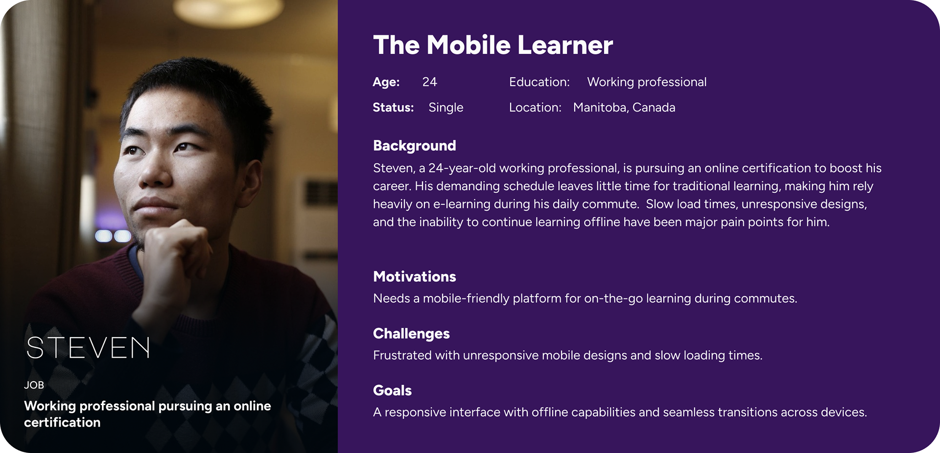
What We Found:
• Students' Aspirations: Simplified access to educational content, real-time feedback, and collaborative spaces.
• Missed Opportunities in Competitors: Static content and interfaces that discouraged deeper engagement.
2. The Resonating Insights
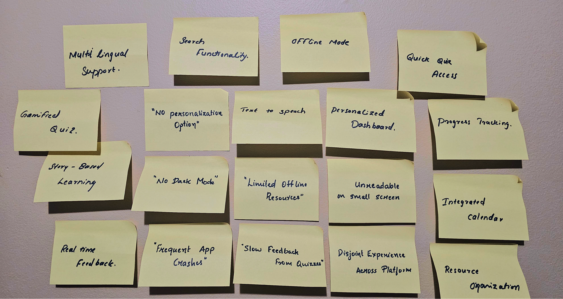
What They Told Us:
Interviews with 10 diverse students revealed:
• Navigation was confusing and overwhelming.
• Features like quizzes and discussions lacked interactivity.
• Unresponsive mobile designs frustrated their on-the-go learning habits.
How We Addressed These Challenges:
• Streamlined navigation with a centralized dashboard that highlights key tools and materials upfront.
• Introduced gamified quizzes and interactive forums to foster engagement and collaboration.
• Optimized the platform for mobile devices, ensuring responsive designs and smooth interactions across various screen sizes.
What We Saw:
• Patterns emerged showing that students gravitate toward platforms that are visually delightful, responsive, and interactive.
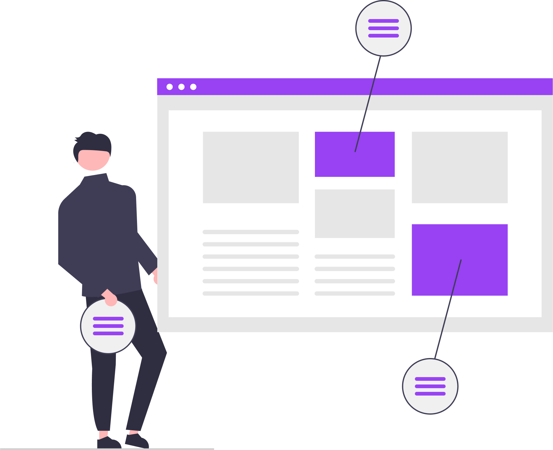
Design Process
1. Empathizing with Students
We delved into their stories, empathizing with their frustrations and aspirations to build a foundation rooted in their needs.
2. Framing Our Approach
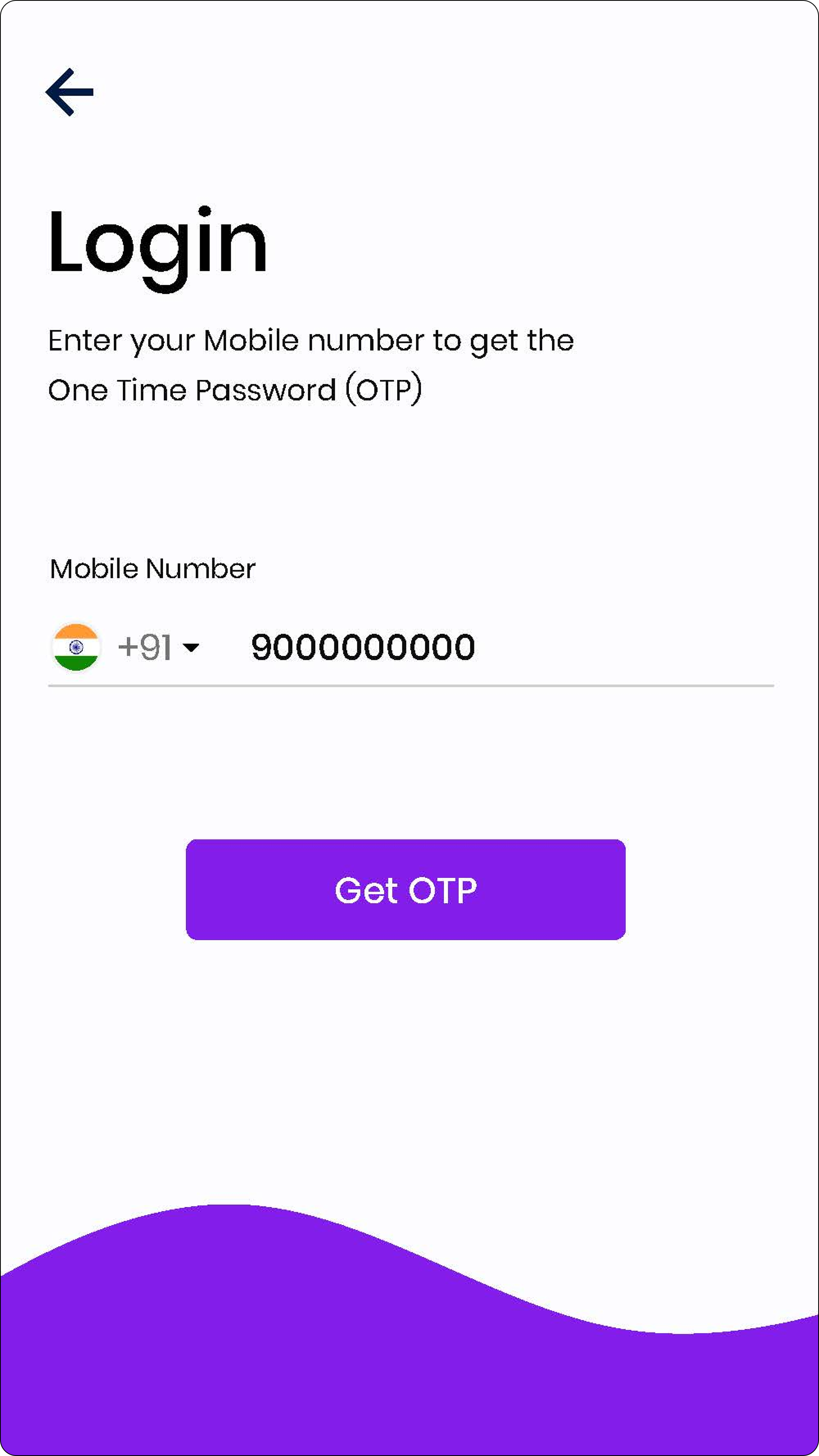
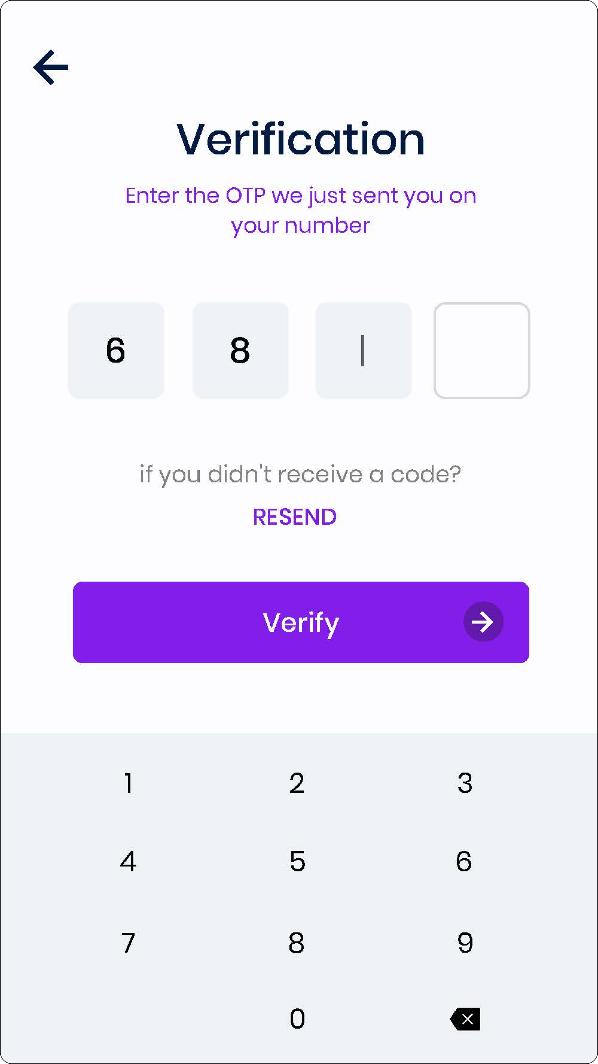
Mobile-first Responsive Design: We transformed constraints into possibilities, ensuring fluid transitions across devices, touch-friendly navigation, and fast-loading pages for consistent learning.
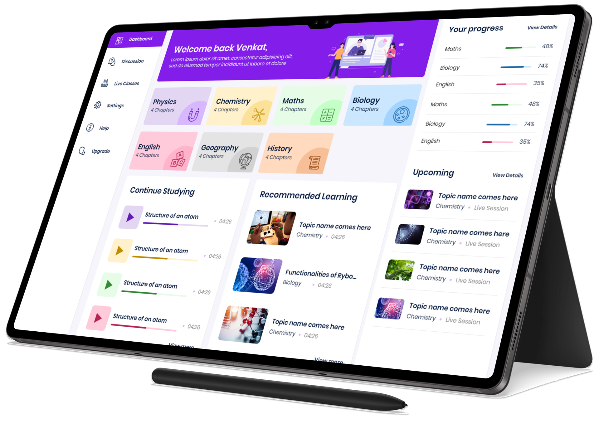
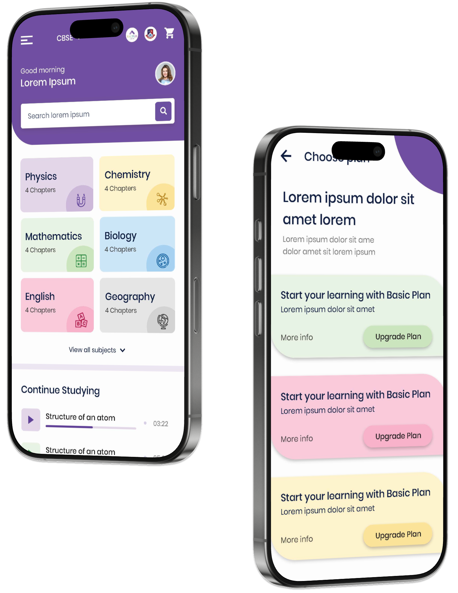
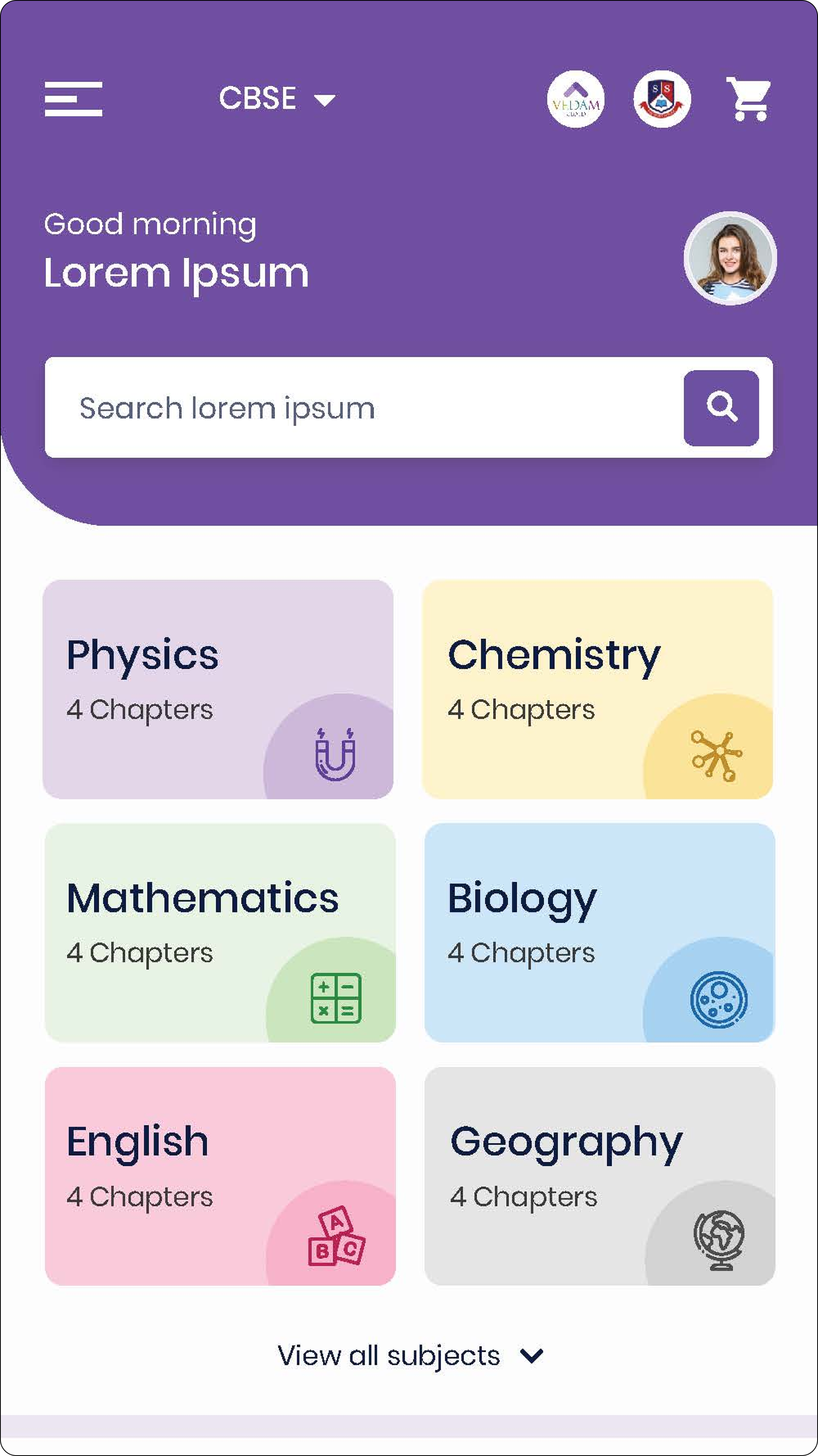
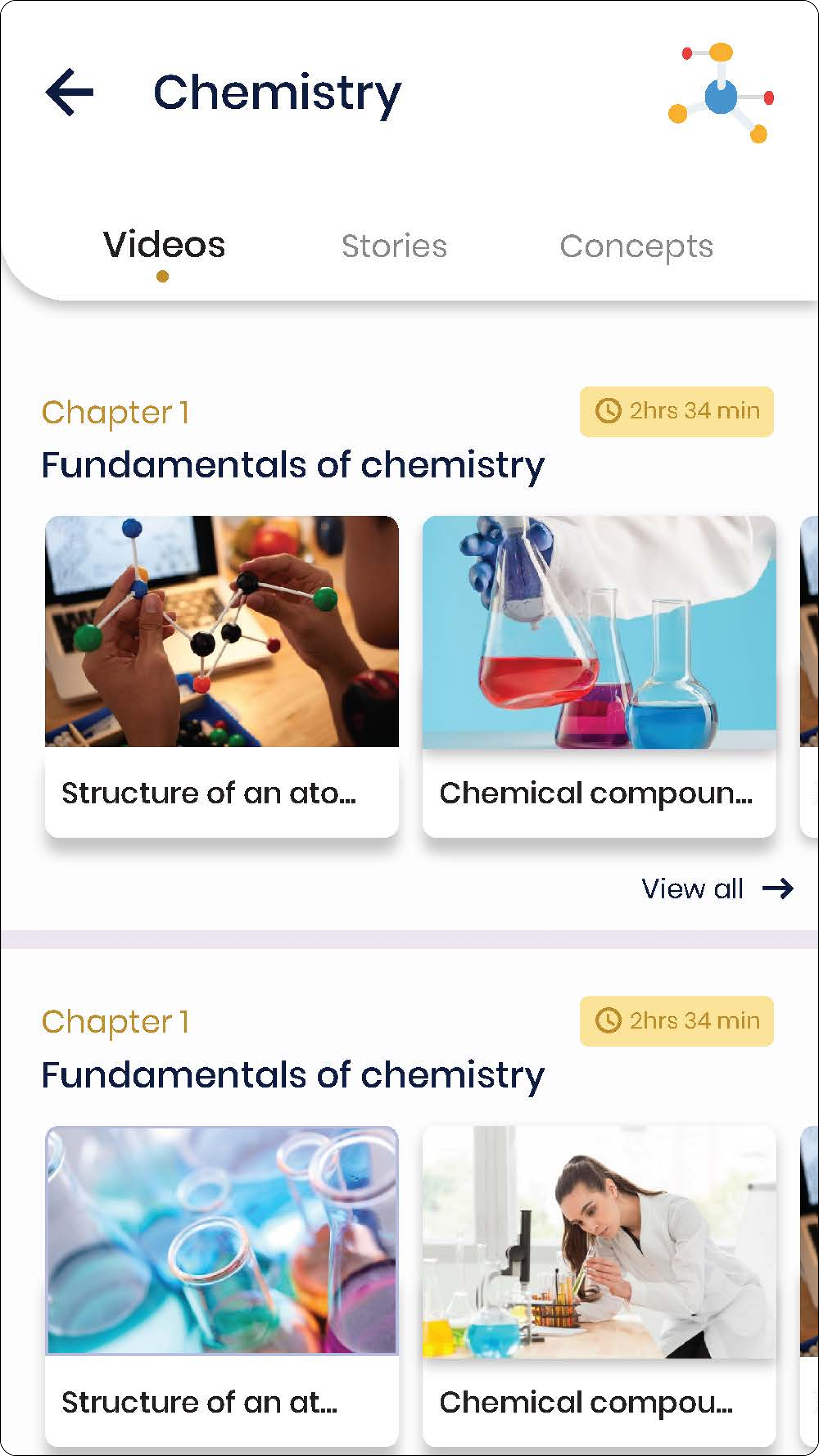
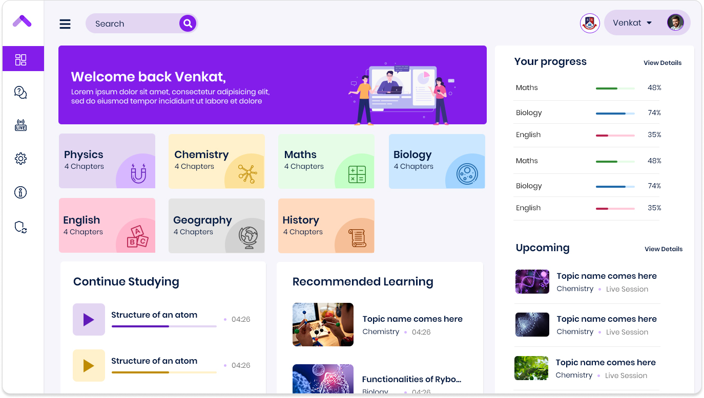
Intuitive Dashboards: Our design simplified complexity. Personalized dashboards highlighted essential details such as progress, deadlines, and performance with just a few clicks.
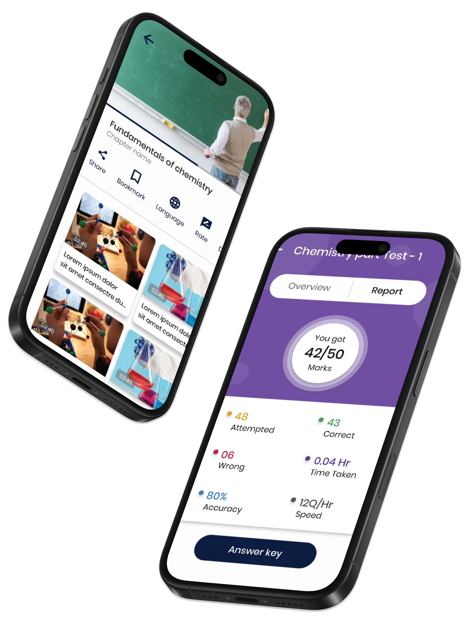
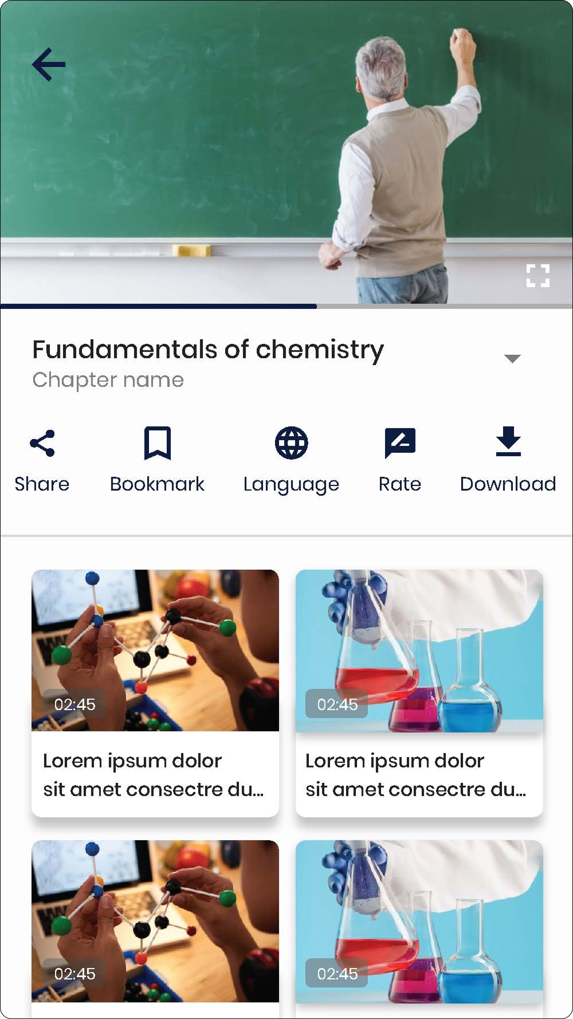
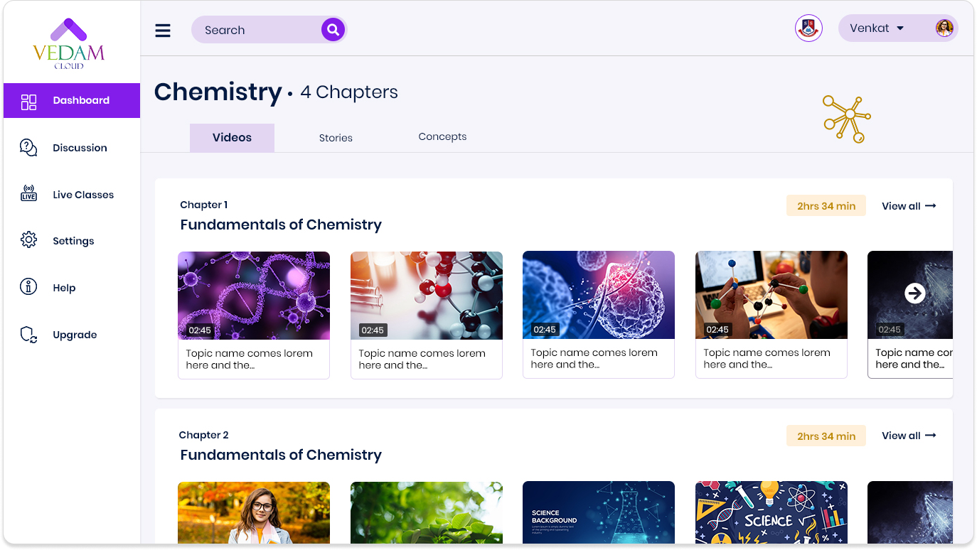
Interactive Learning Tools: We brought gamification to life:
• Quizzes became dynamic challenges, sparking excitement and learning.
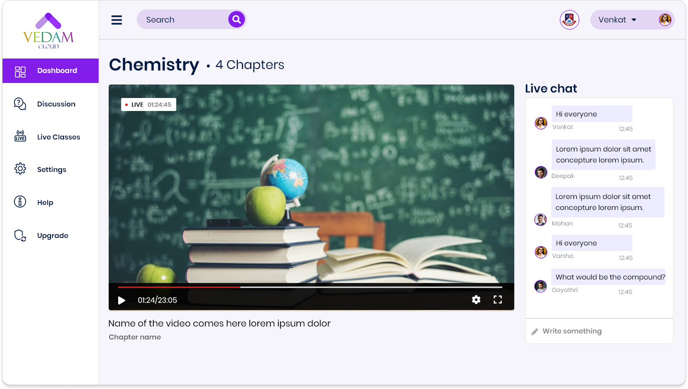
• Discussions morphed into structured, collaborative forums for peer learning.
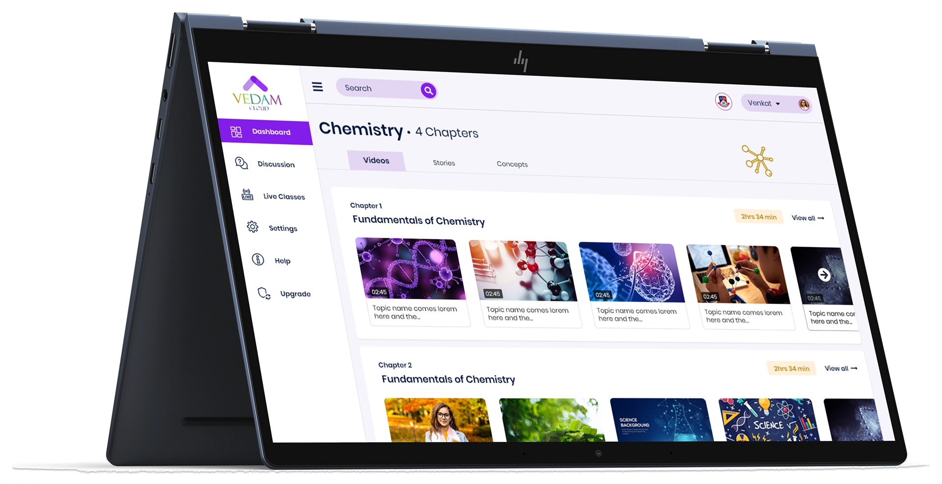
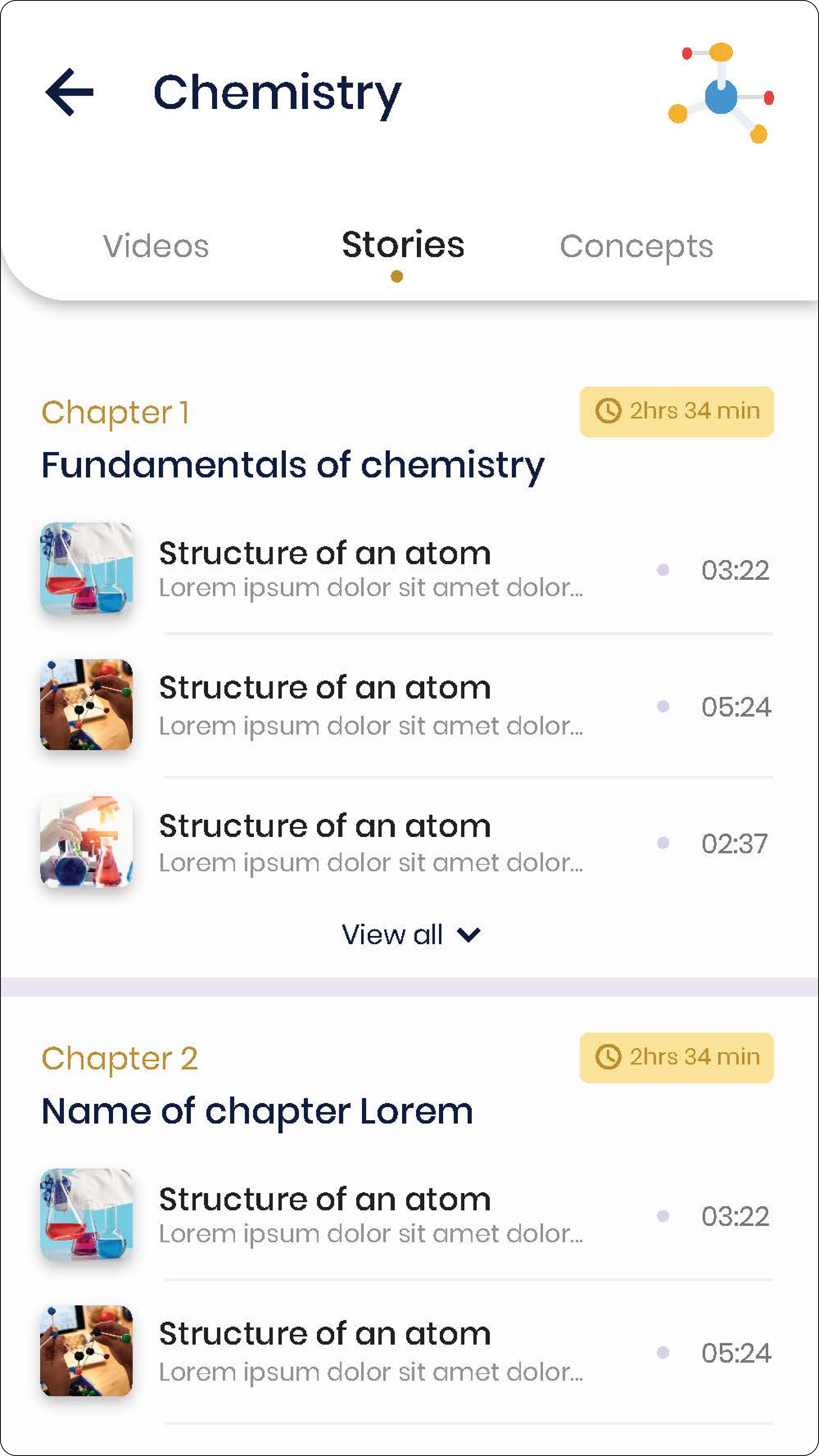
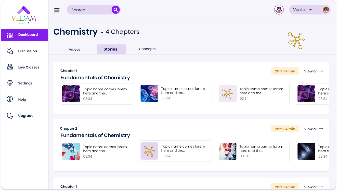
• Stories turned bite-sized lessons into captivating microlearning experiences.
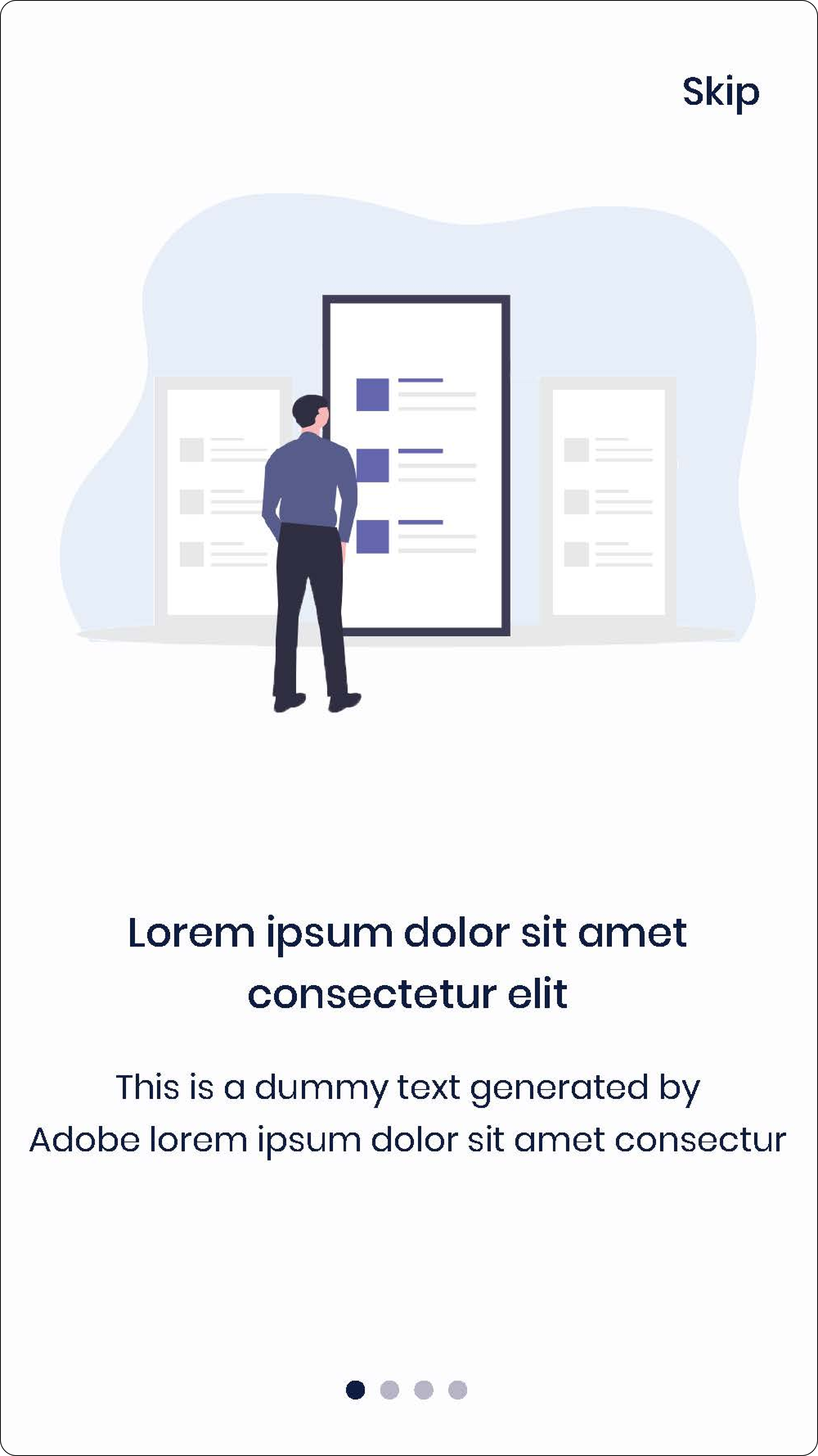
3. Dreaming Big - And Ideating Boldly
We sketched concepts that reimagined engagement and tested low-fidelity prototypes, iterating until the vision felt real.


4. Breathing Life into Designs
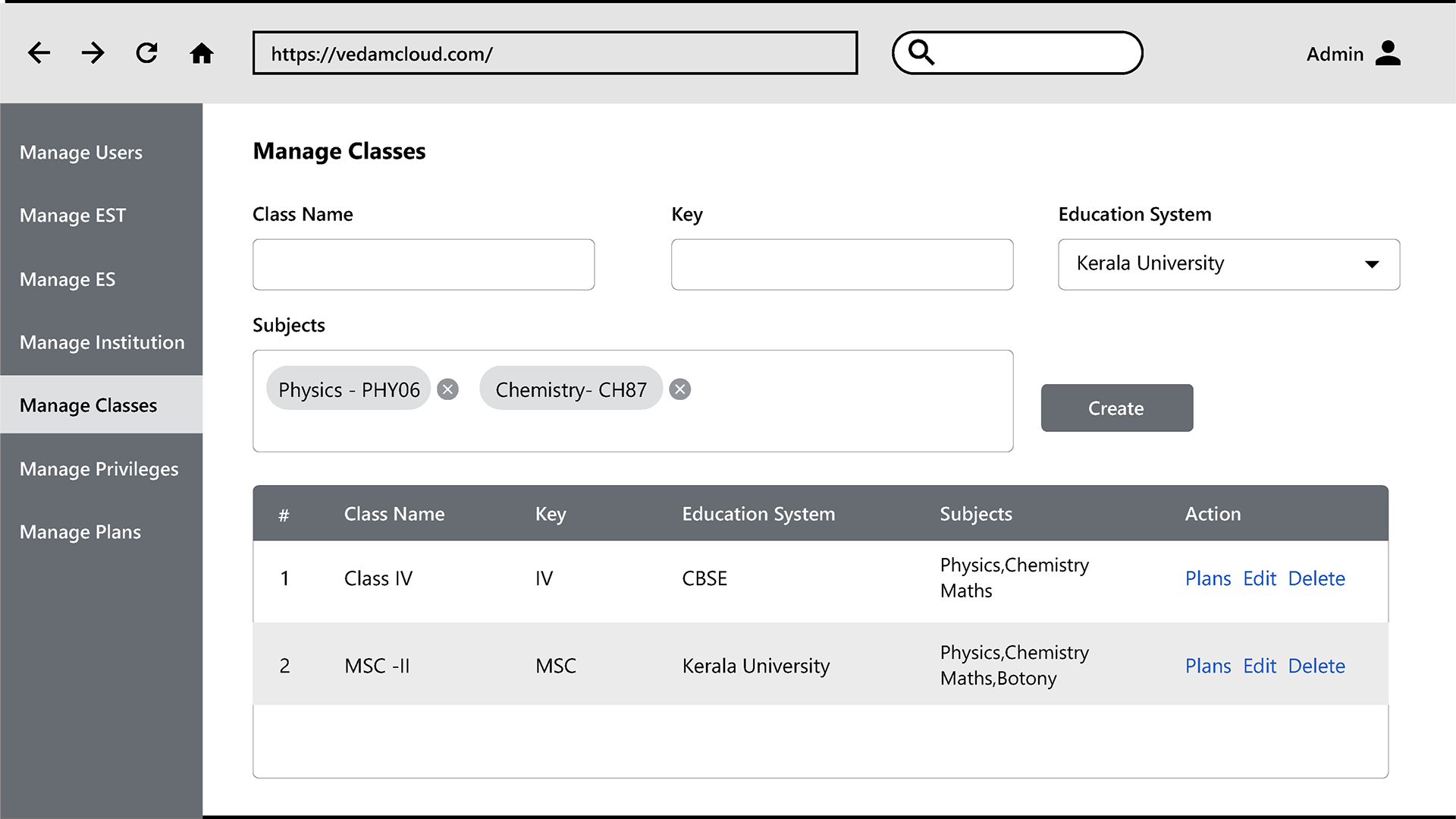
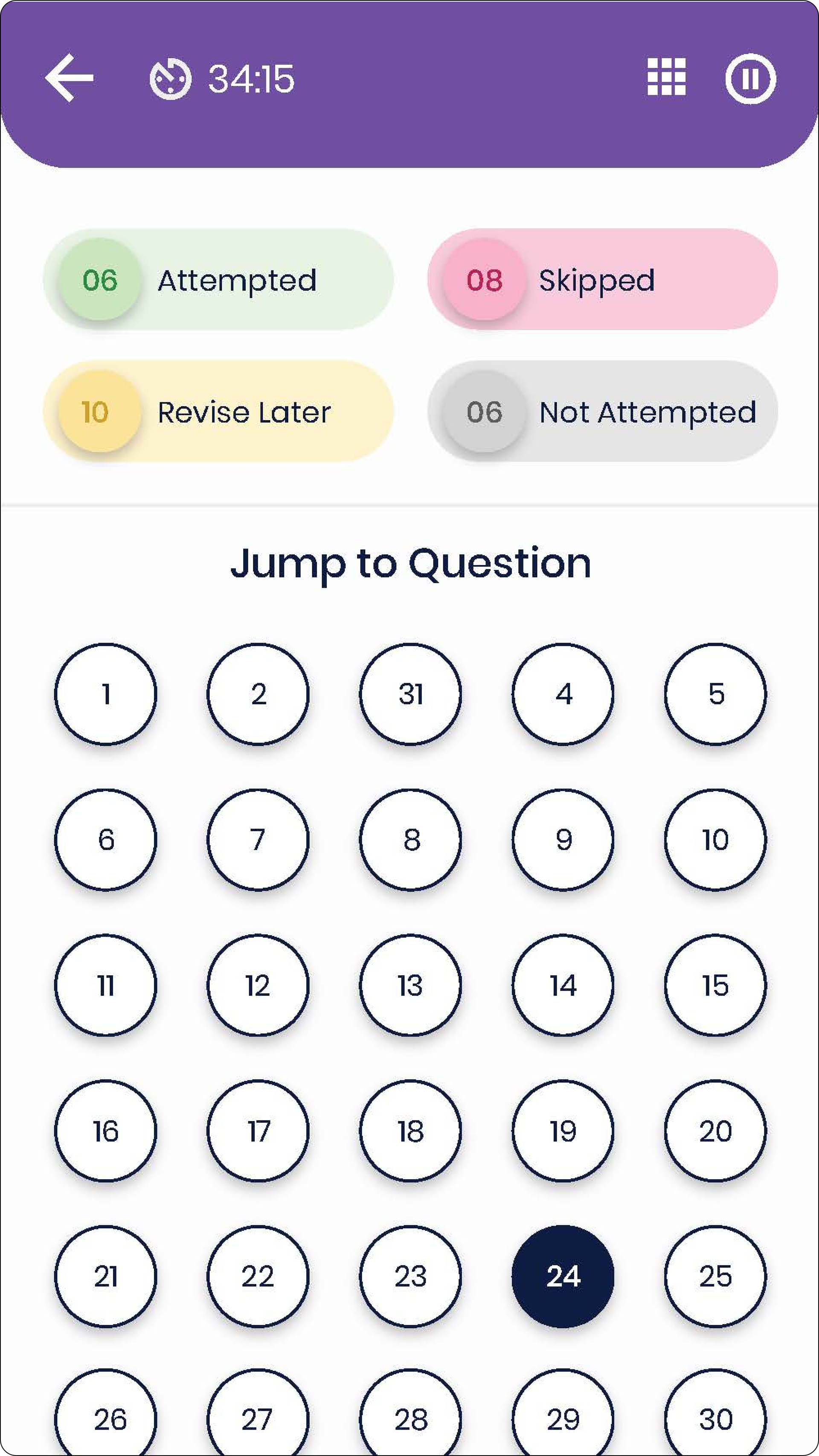
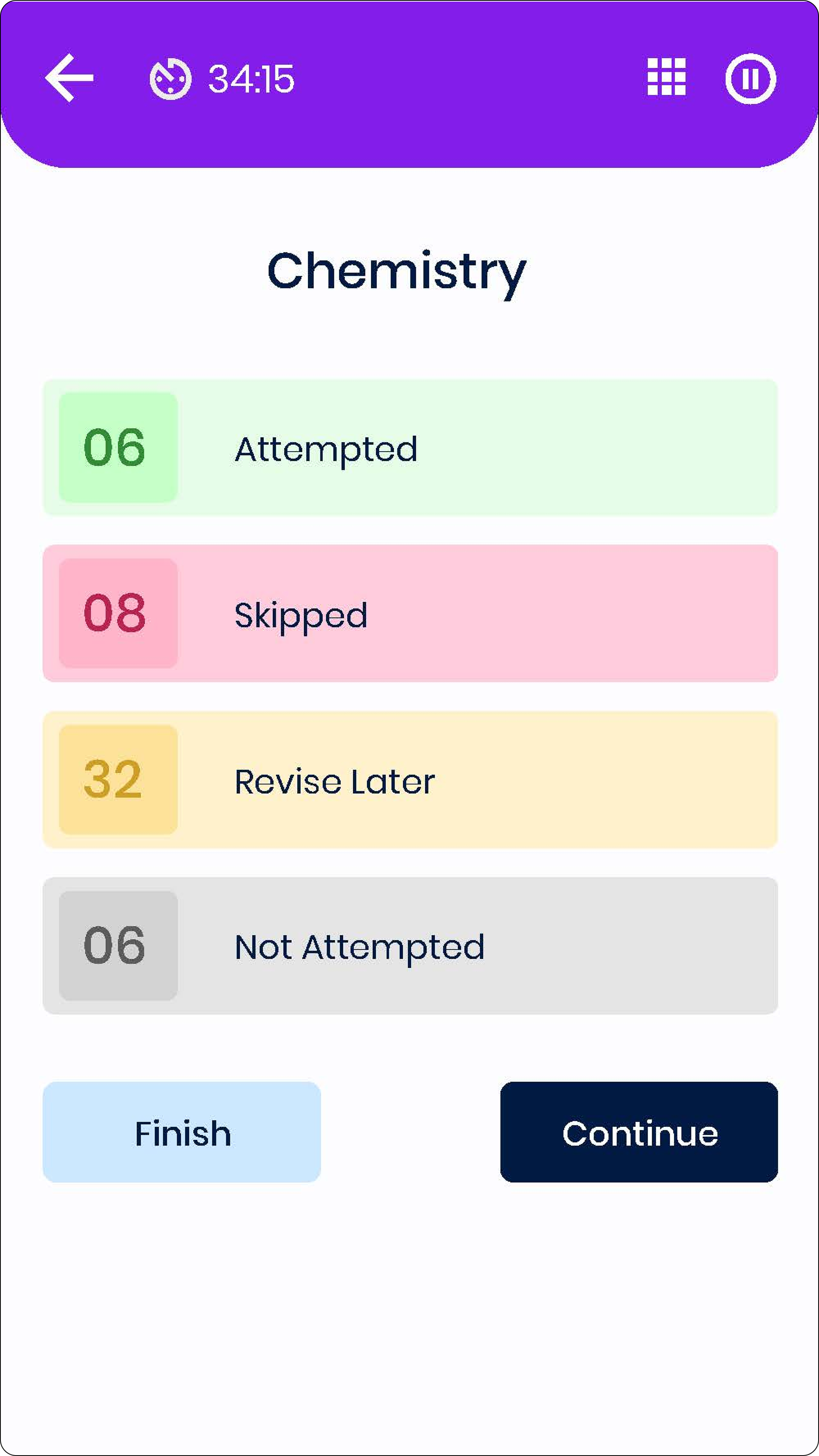
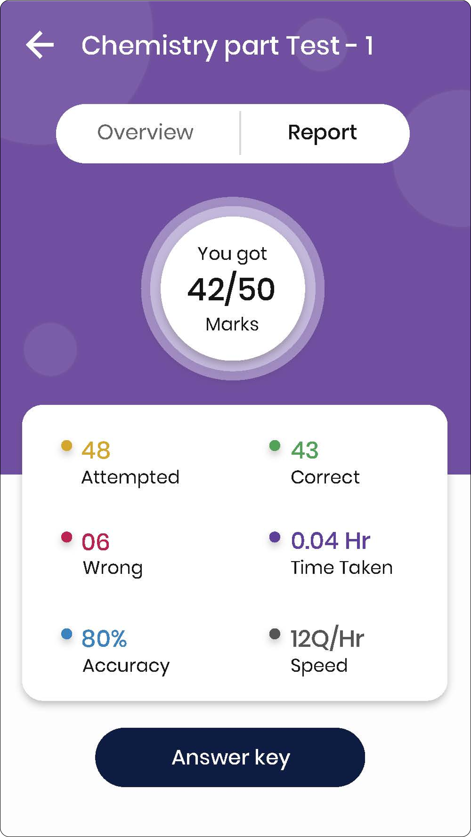
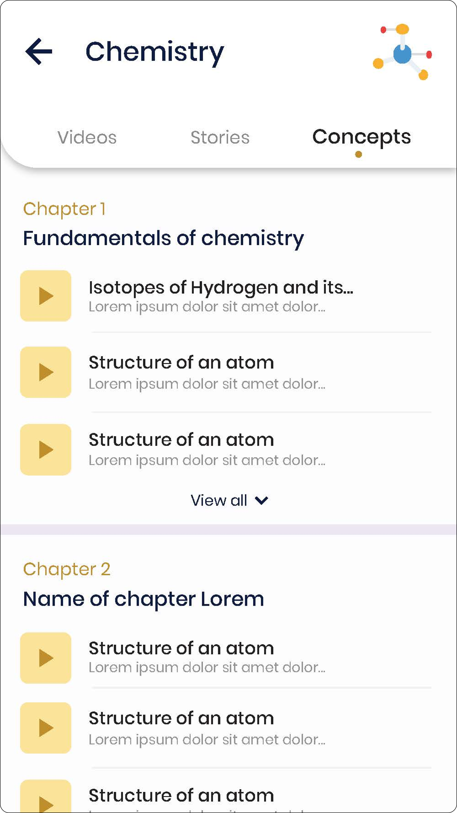
High-fidelity prototypes told the story visually: from dashboards to gamified elements, we designed solutions that clicked.
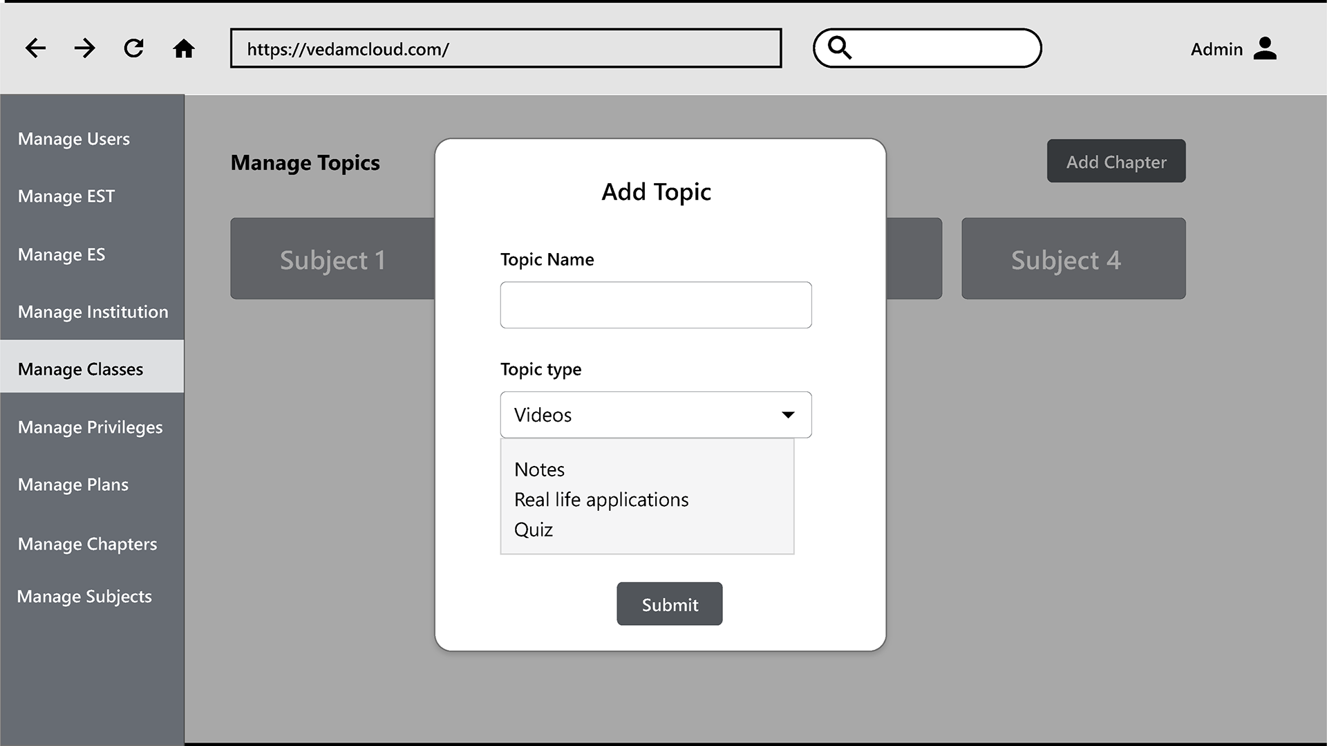
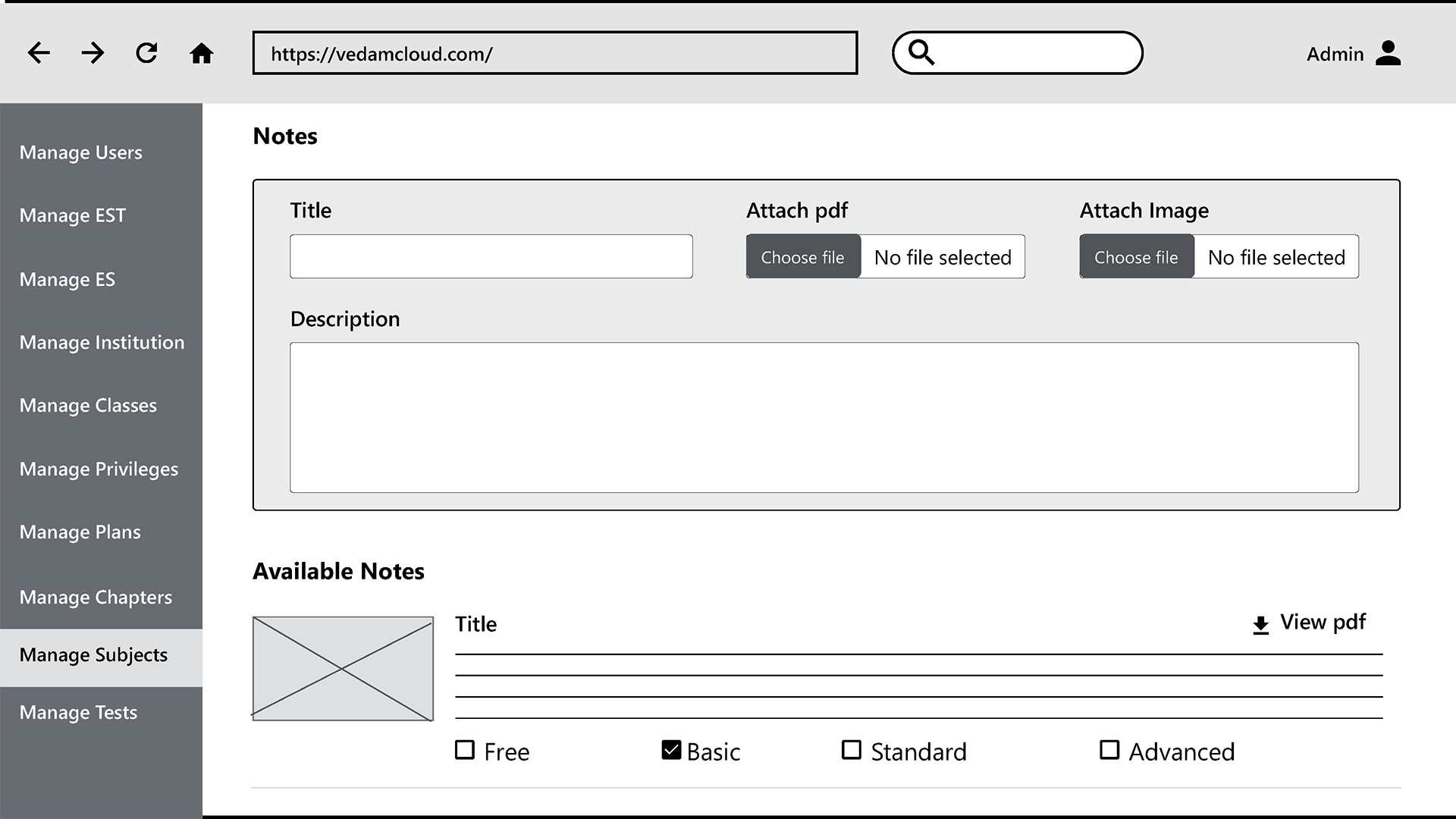
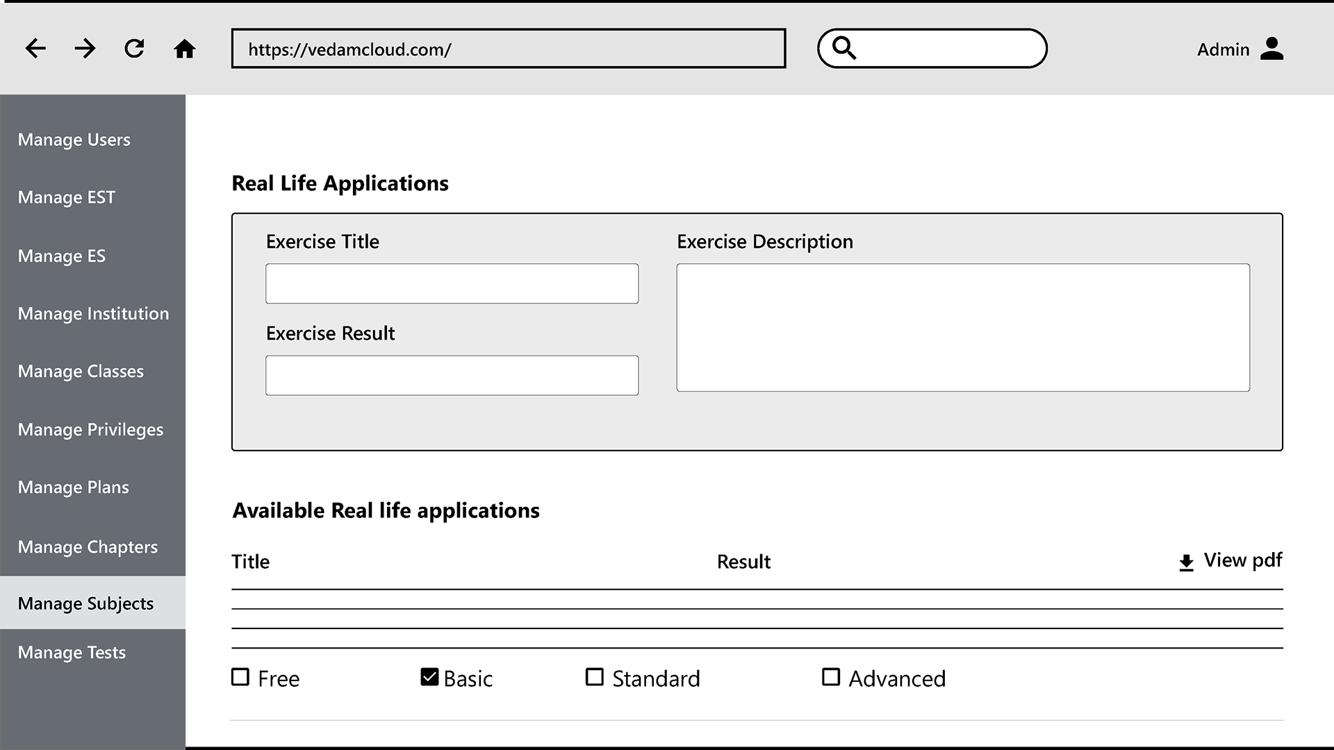
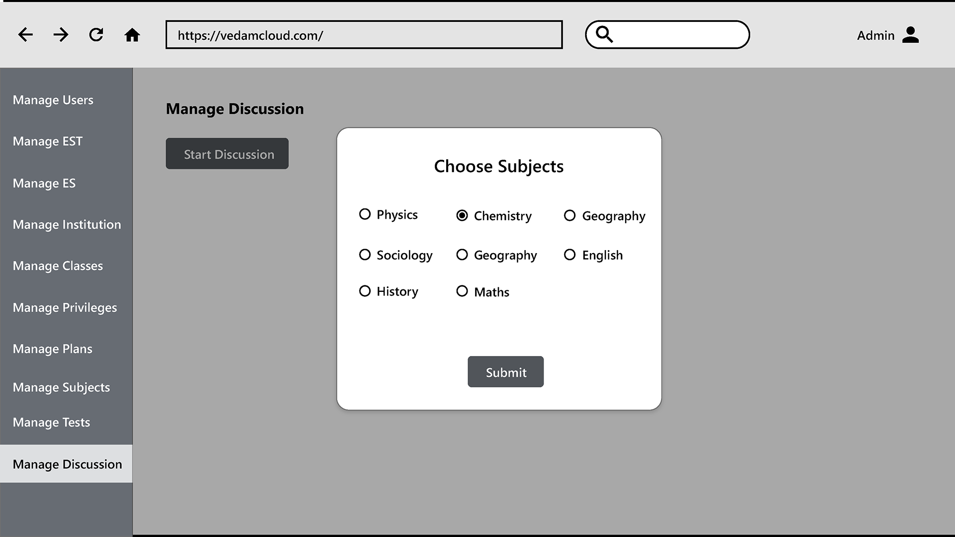
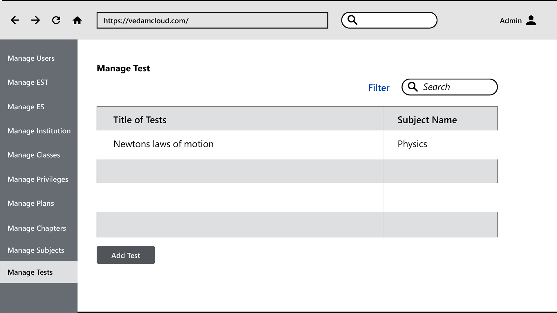
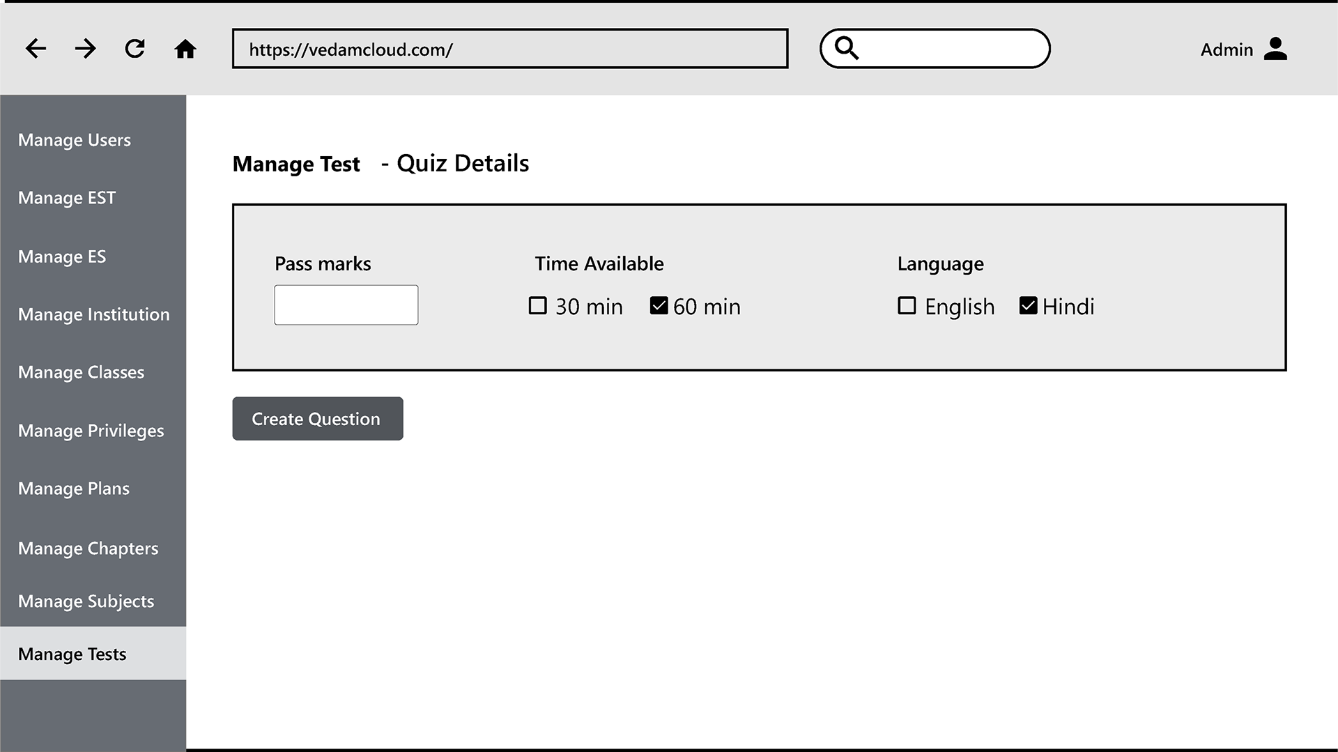
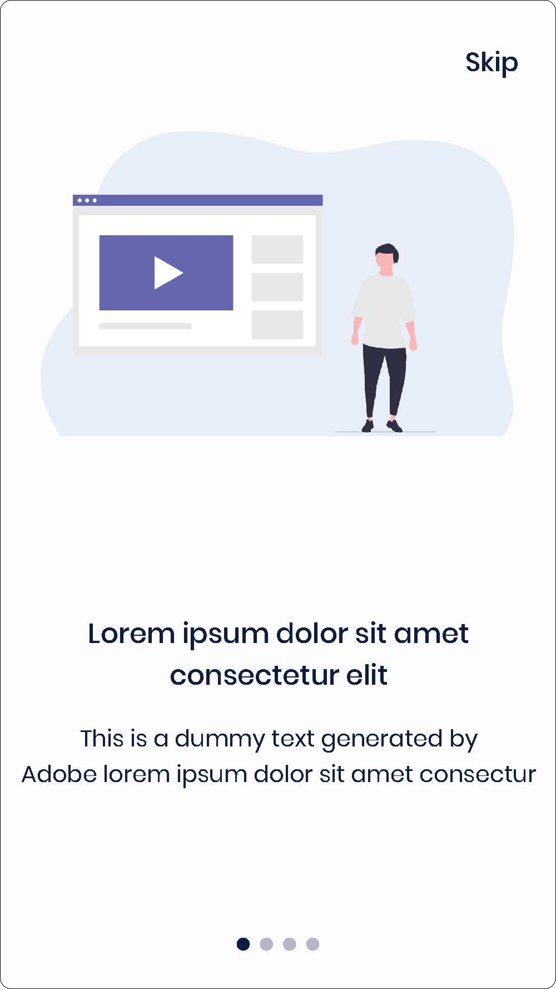
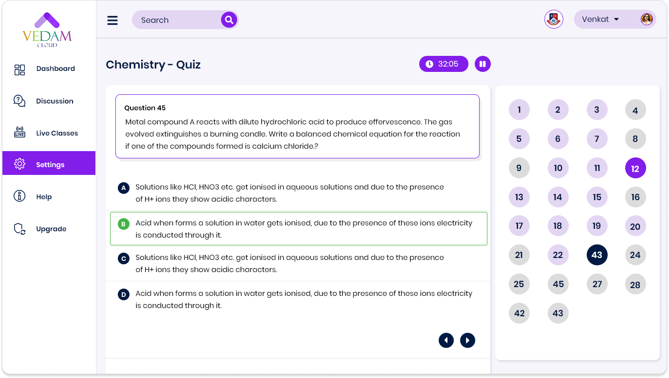
Other Screens


5. Listening and Refining
With 15 users testing our work, we refined tirelessly:
• Data-Driven Iterations: Conducted multiple rounds of usability testing, capturing feedback to adjust navigation and enhance user satisfaction.
• Personalized Improvements: Based on feedback, we introduced tailored features like progress tracking and individualized recommendations.
• Accessibility Enhancements: Incorporated user suggestions to improve color contrast, font sizes, and keyboard navigation for inclusivity.
• Real-Time Feedback Mechanisms: Added features like immediate quiz results and discussion notifications to keep users engaged.
• User-Centric Adjustments: Reworked confusing pathways and optimized tool placement to reduce cognitive load.
Results:
• 90% found navigation fluid.
• 85% said gamified tools inspired them.
• 70% reported reduced frustration with mobile responsiveness.
Key Features
Dashboards as Compasses: Personalized views offering clarity and focus.
Learning with a Twist:
• Quizzes that motivated.
• Stories that captivated.
• Discussions that connected.
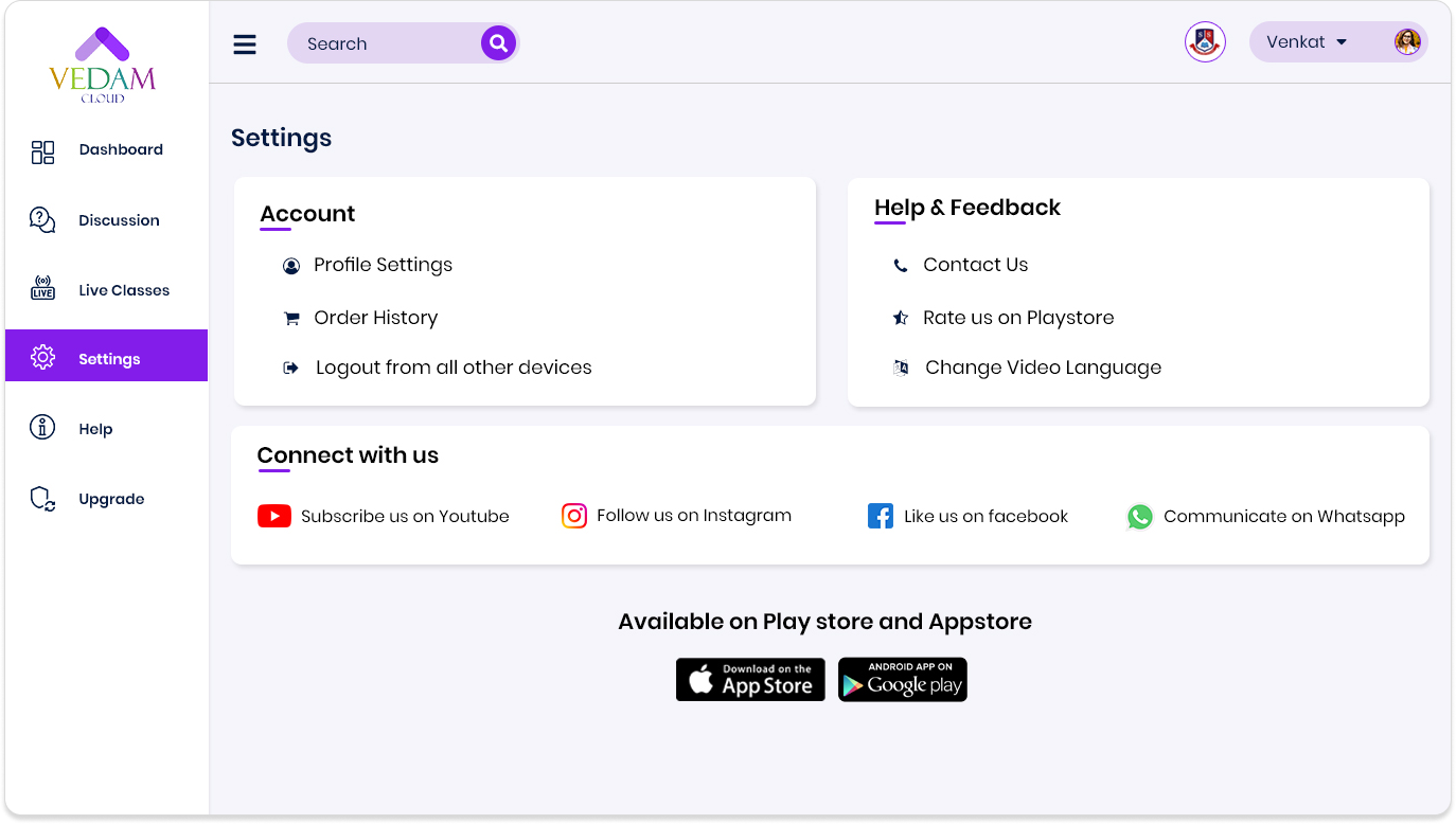
Accessibility for All:
• A mobile-first philosophy, ensuring seamless transitions.
• Enhanced contrast and inclusive design for a diverse audience.
Impact Unveiled
Results That Speak:
• Engagement Boost: A 50% rise in user activity.
• User Delight: 90% rated it 4.5/5 or higher.
• Accessibility Wins: Over 70% reported seamless mobile experiences.
Reflections on the Journey
Lessons Learned:
• Iterative testing revealed hidden pain points and new opportunities.
• Functionality doesn’t have to compromise beauty.
• Collaboration sparked brilliance at every step.
• What We Took Away: Our users showed us that empathy and curiosity fuel innovation.
Conclusion
Vedam Cloud isn’t just an e-learning platform; it’s a transformative experience. By blending human-centered design with cutting-edge solutions, we redefined how students learn and connect.
Beyond the immediate improvements in user engagement and satisfaction, Vedam Cloud stands as a testament to the power of iterative design and collaboration. It showcases how empathy, data-driven insights, and creative problem-solving can come together to create impactful solutions.
This journey reinforced the importance of understanding user needs at every step, validating decisions with real feedback, and continuously refining until the solution resonates deeply with the audience.
Thank you for your time!
Feel free to provide your valuable suggestions and comments at joyatjoseph619@gmail.com
Feel free to provide your valuable suggestions and comments at joyatjoseph619@gmail.com